
let's bring your project to fruition with frooishen.
casey@frooishen.com
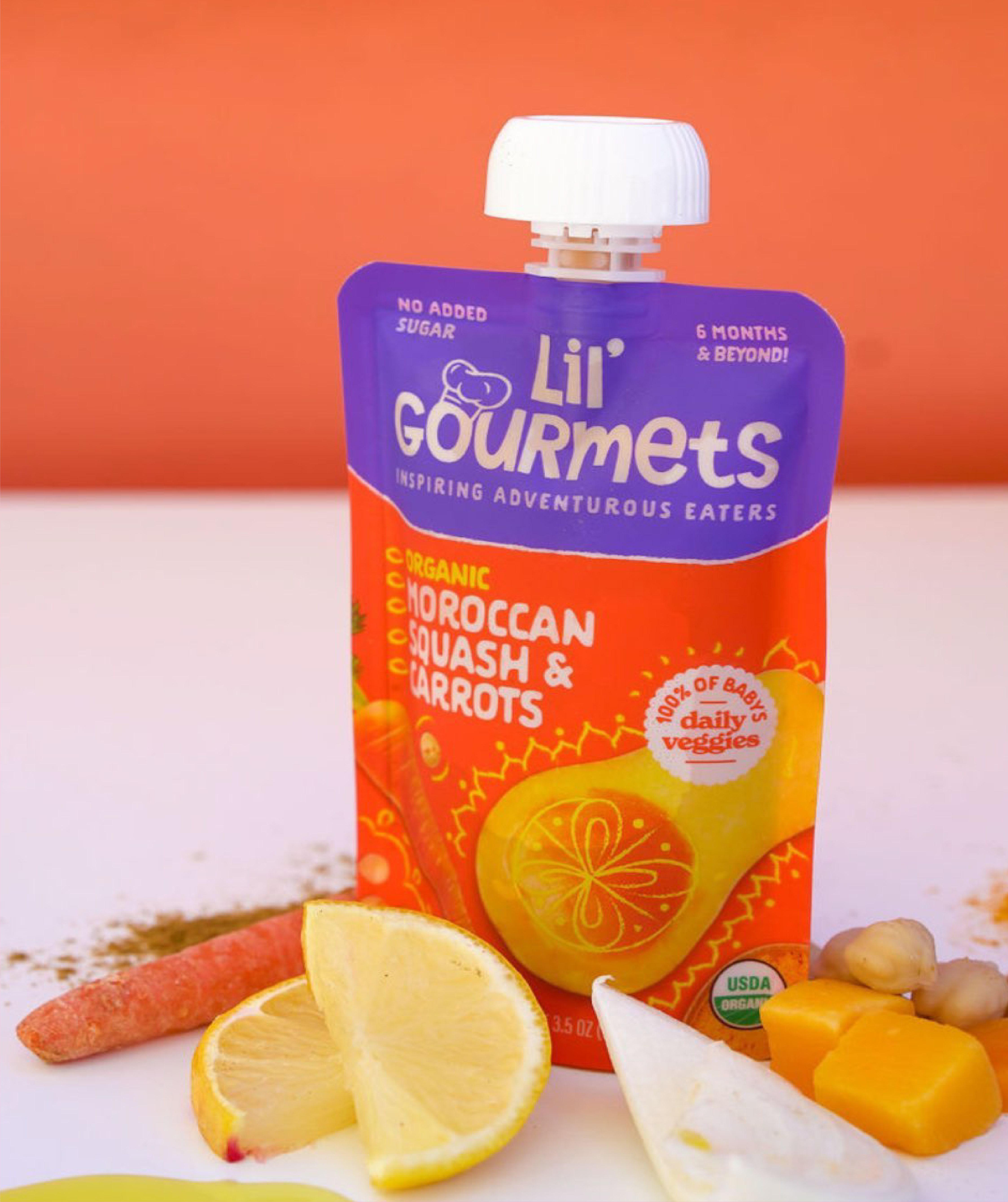
Our strategy focused on broadening Lil’ Gourmets’ appeal to both kids and parents while reinforcing the core promise: Veggie First. Global Flavors. Fresh Ingredients. The new identity needed to clearly communicate these points, stand out on shelf and resonate with today’s health-conscious, flavor-seeking families.
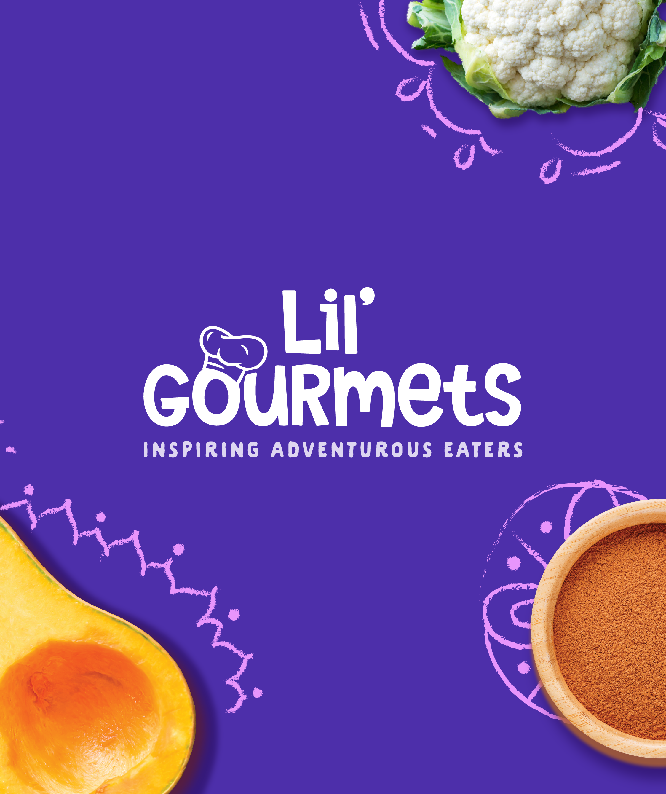
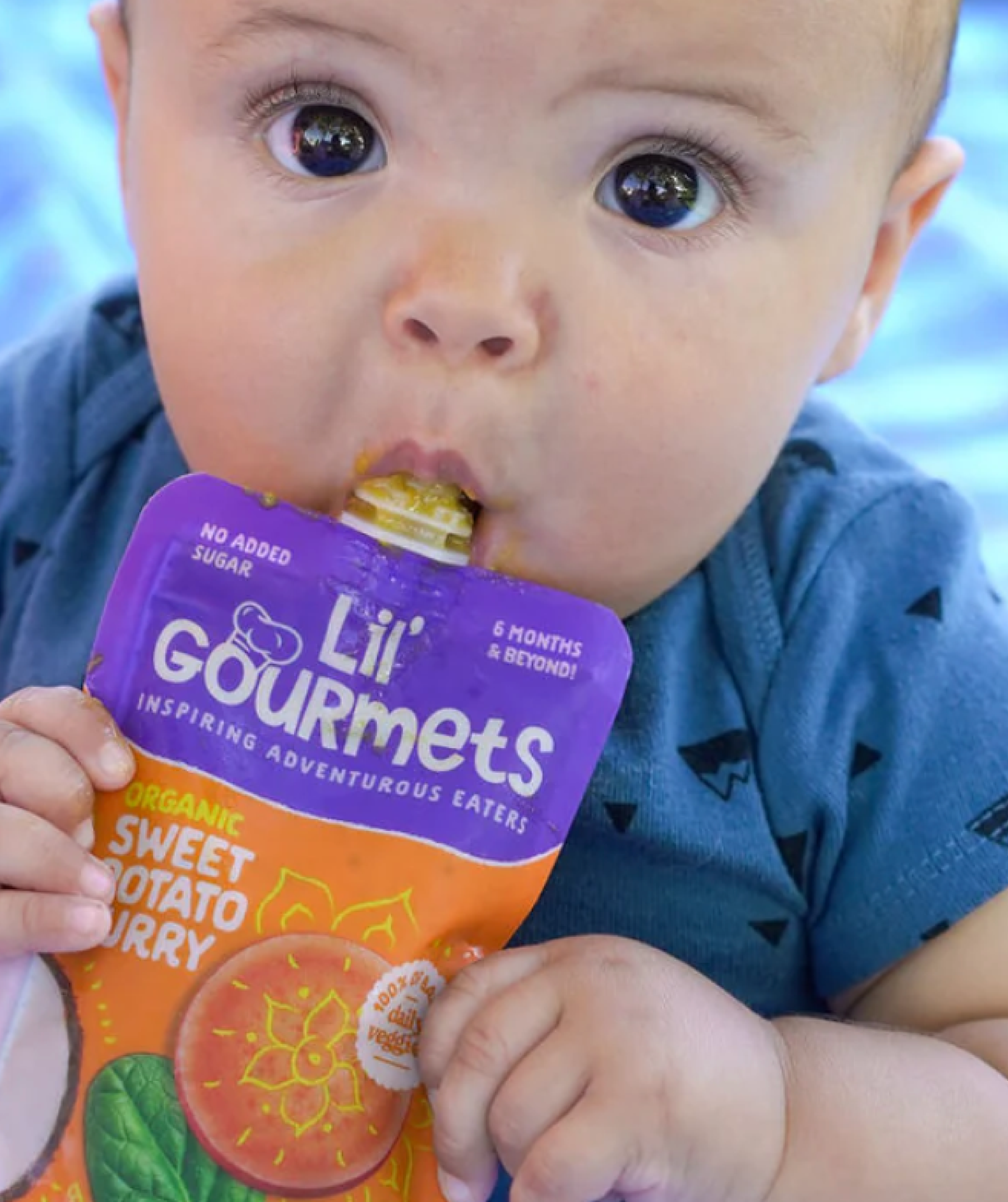
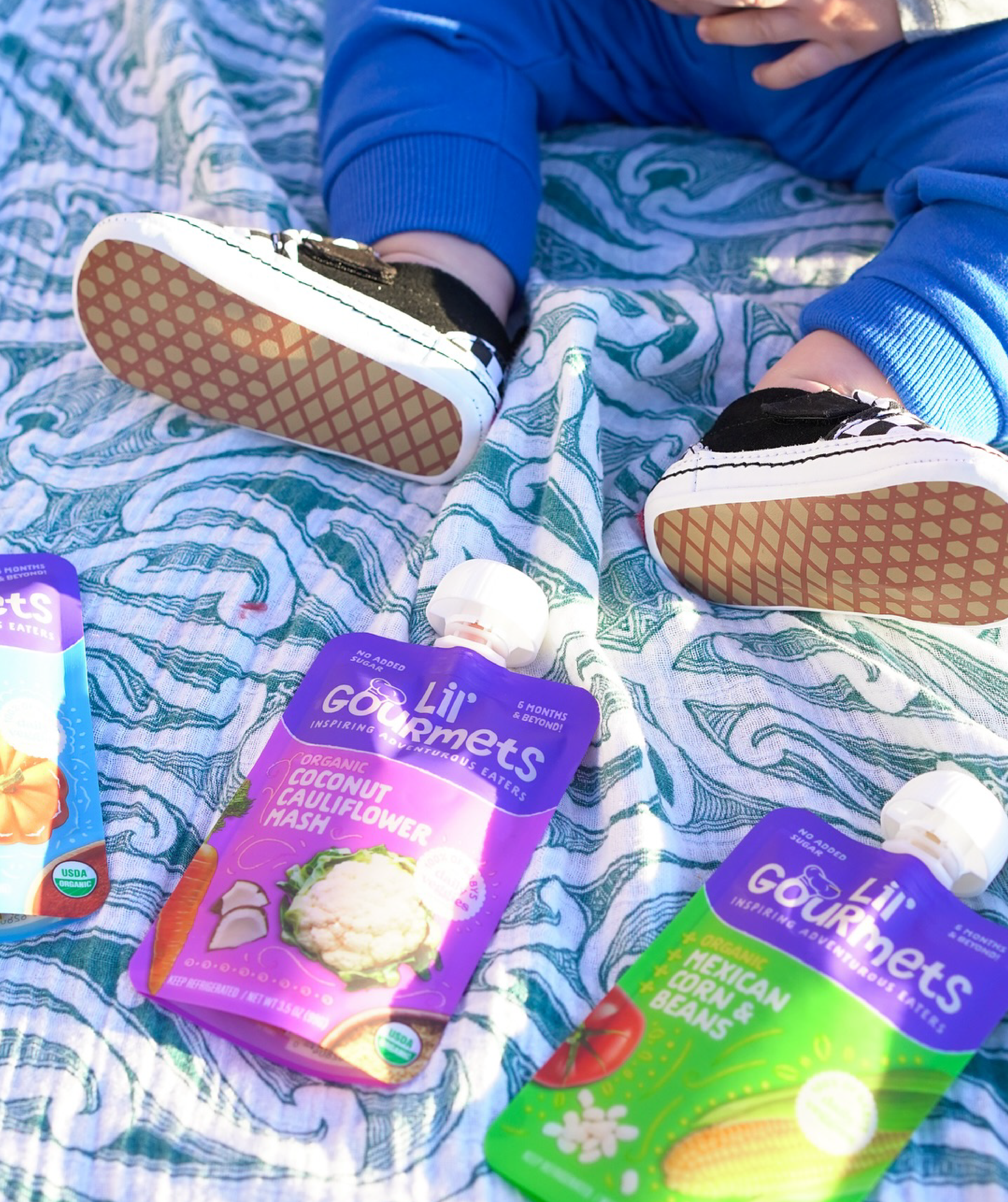
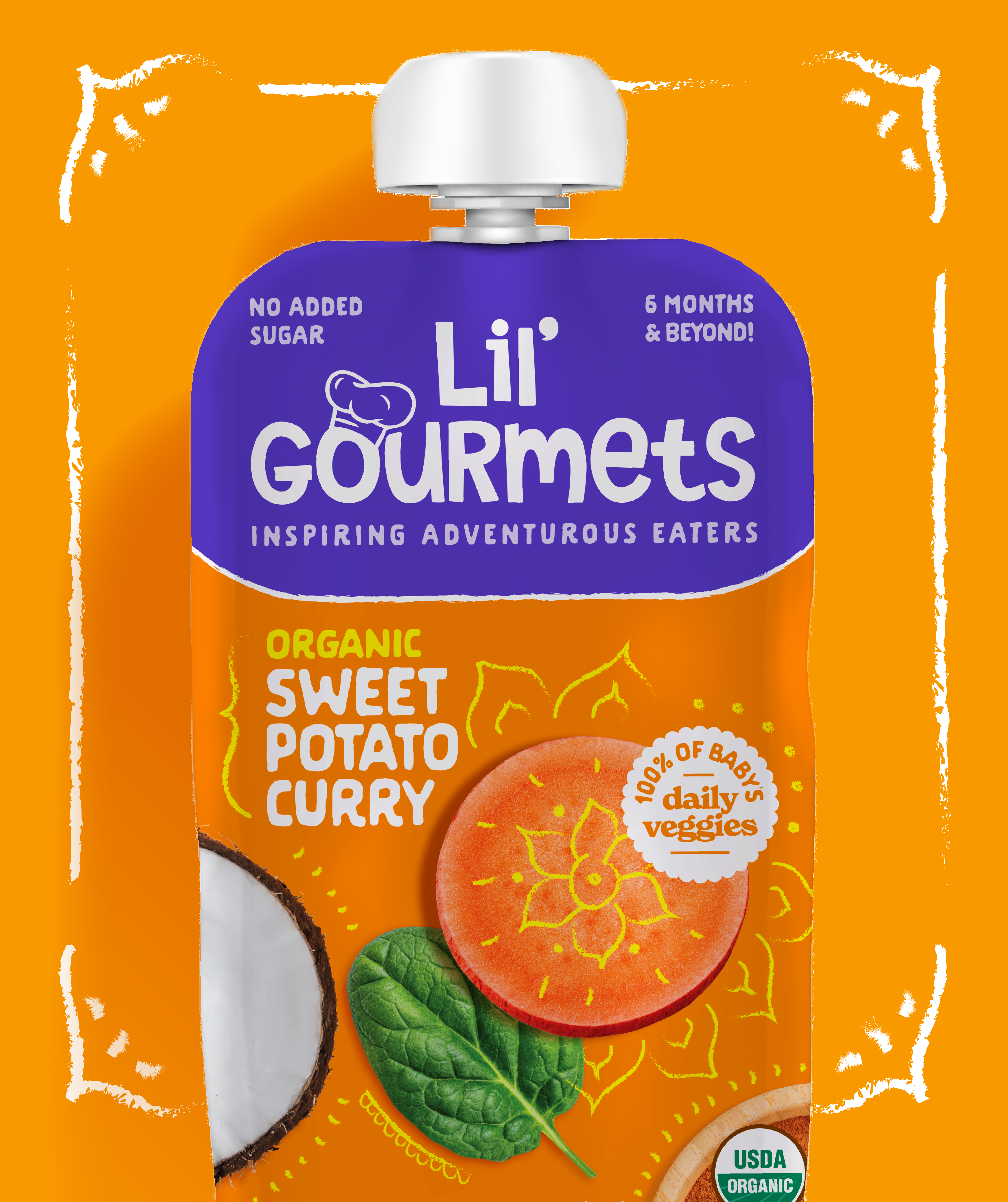
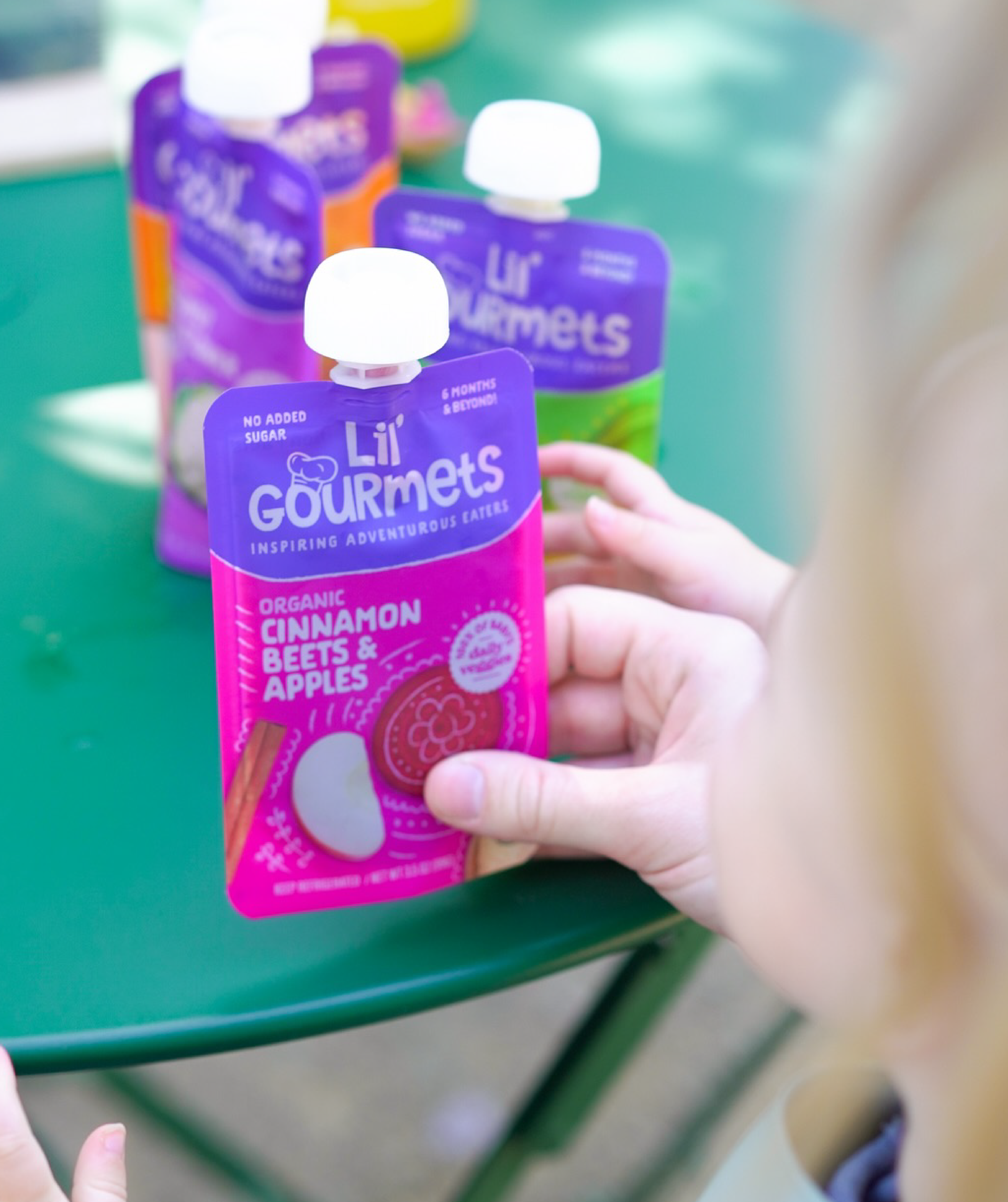
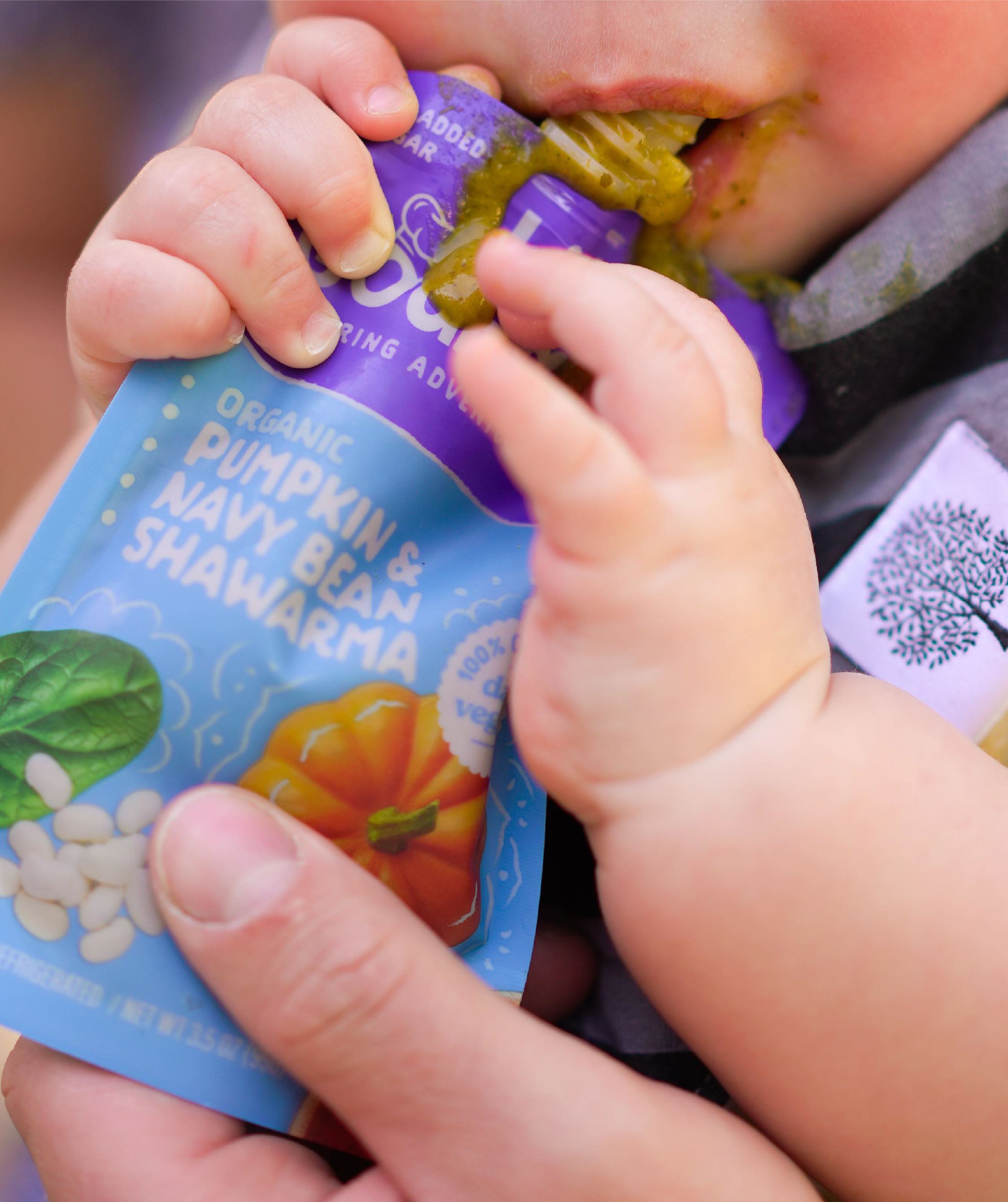
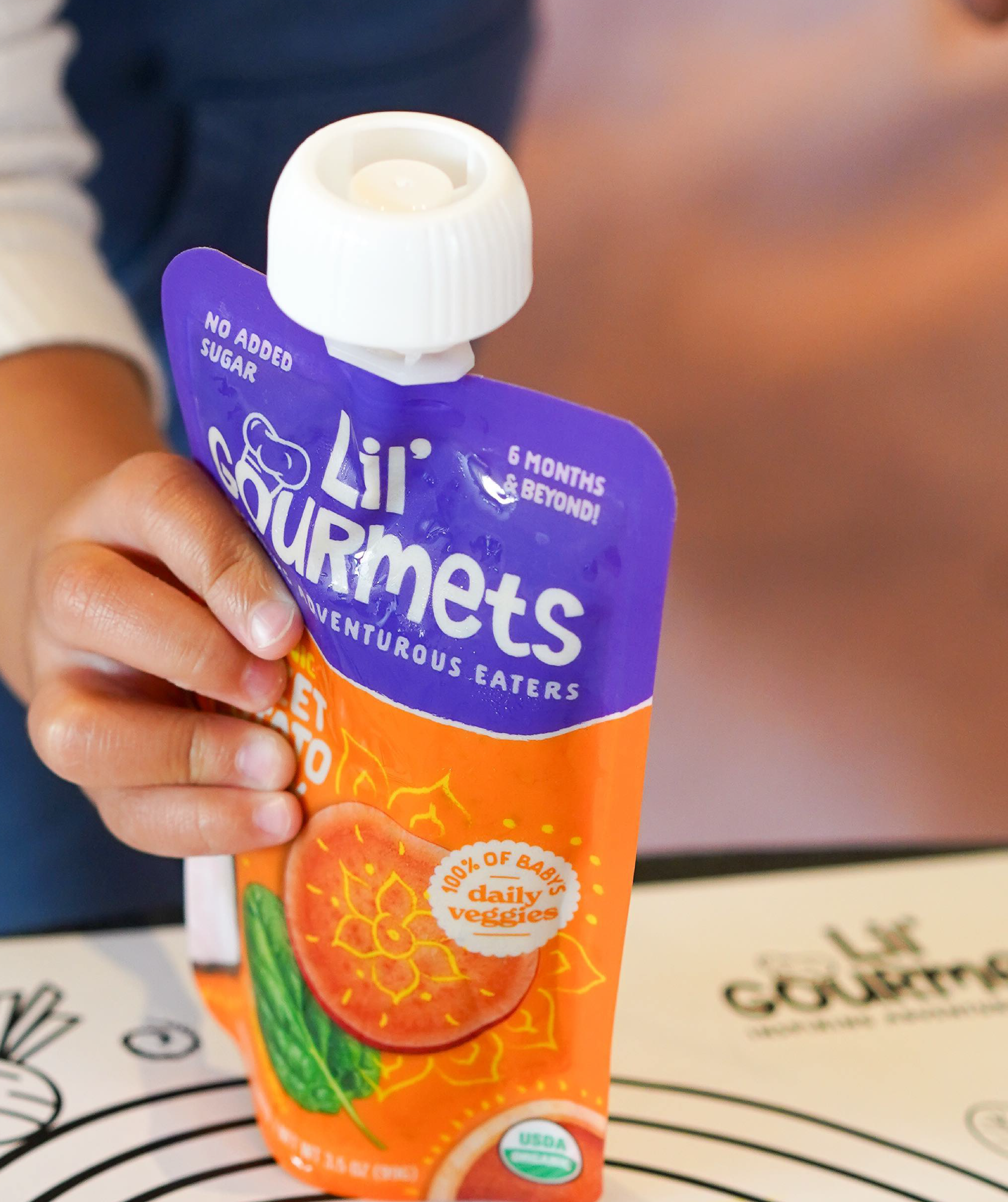
We aimed to strike a balance between everyday relatability and a sense of discovery. The refreshed logo brings the brand to life, with warmth and meaning. A bold yet approachable purple background now anchors the brand block, aiding visual recognition while delivering a more expressive and emotionally resonant identity. The playful chef’s hat adds a touch of charm and hints at the inspired global flavors behind each recipe. To emphasize the quality of ingredients, we incorporated a mix of illustration and photography that showcases freshness and transparency. These visuals highlight the real, organic foods inside every pouch—helping parents feel confident in what they’re feeding their little ones. The layered design approach adds richness and depth, reinforcing both trust and emotional connection.
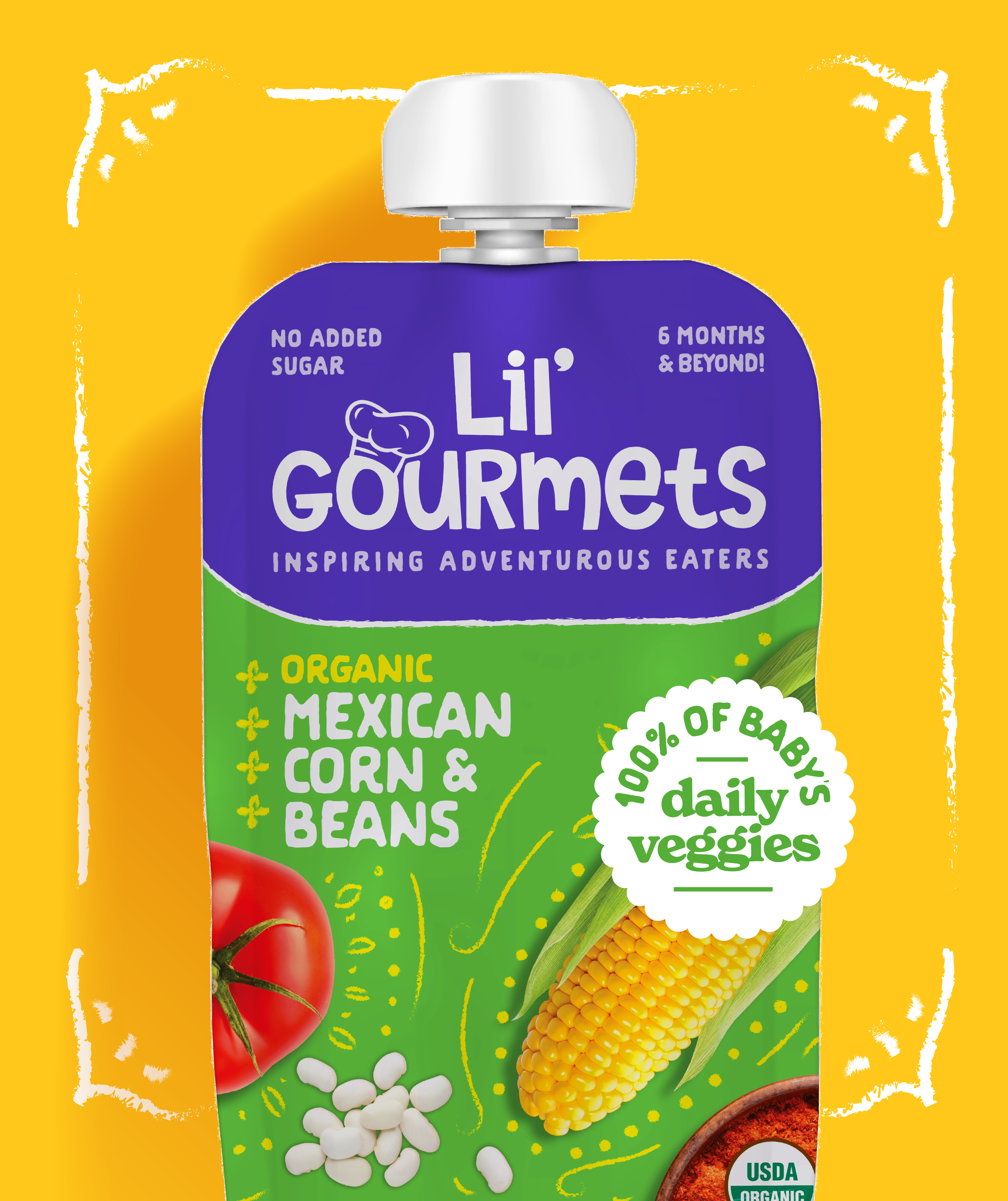
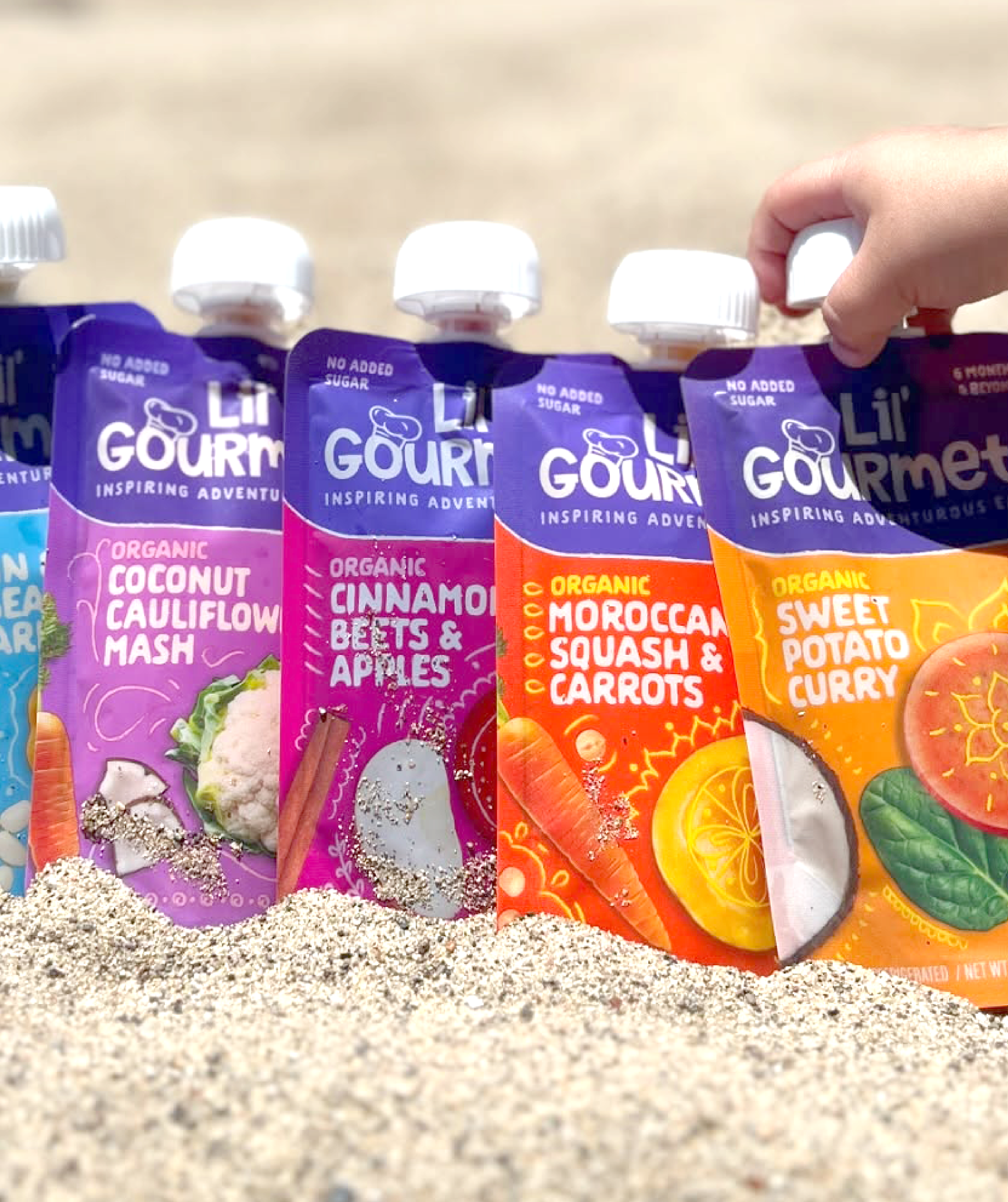
We also refined the communication hierarchy to better resonate with a broader audience. The updated wordmark font lends a strong visual impact while maintaining a kid-friendly, inviting feel. A newly crafted tagline clearly communicates the brand’s core value, while simplified flavor names make it easier for parents to navigate—without losing the cultural references that support the brand’s global story and flavor authenticity.
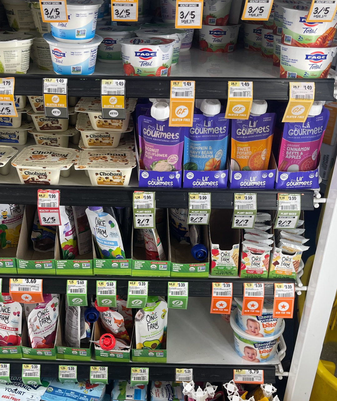
A bold new cohesive identity and package design helped Lil’ Gourmets become a brand that has considerably greater shelf impact and one that is approachable, flavorful and ready for growth.