let's bring your project to fruition with frooishen.
casey@frooishen.com
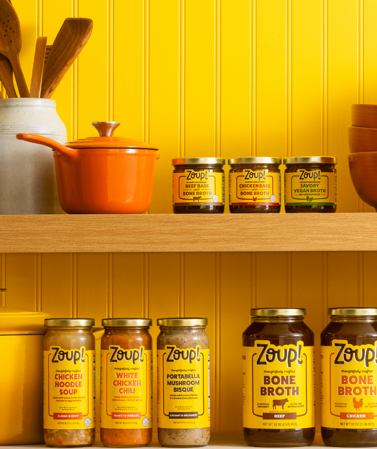
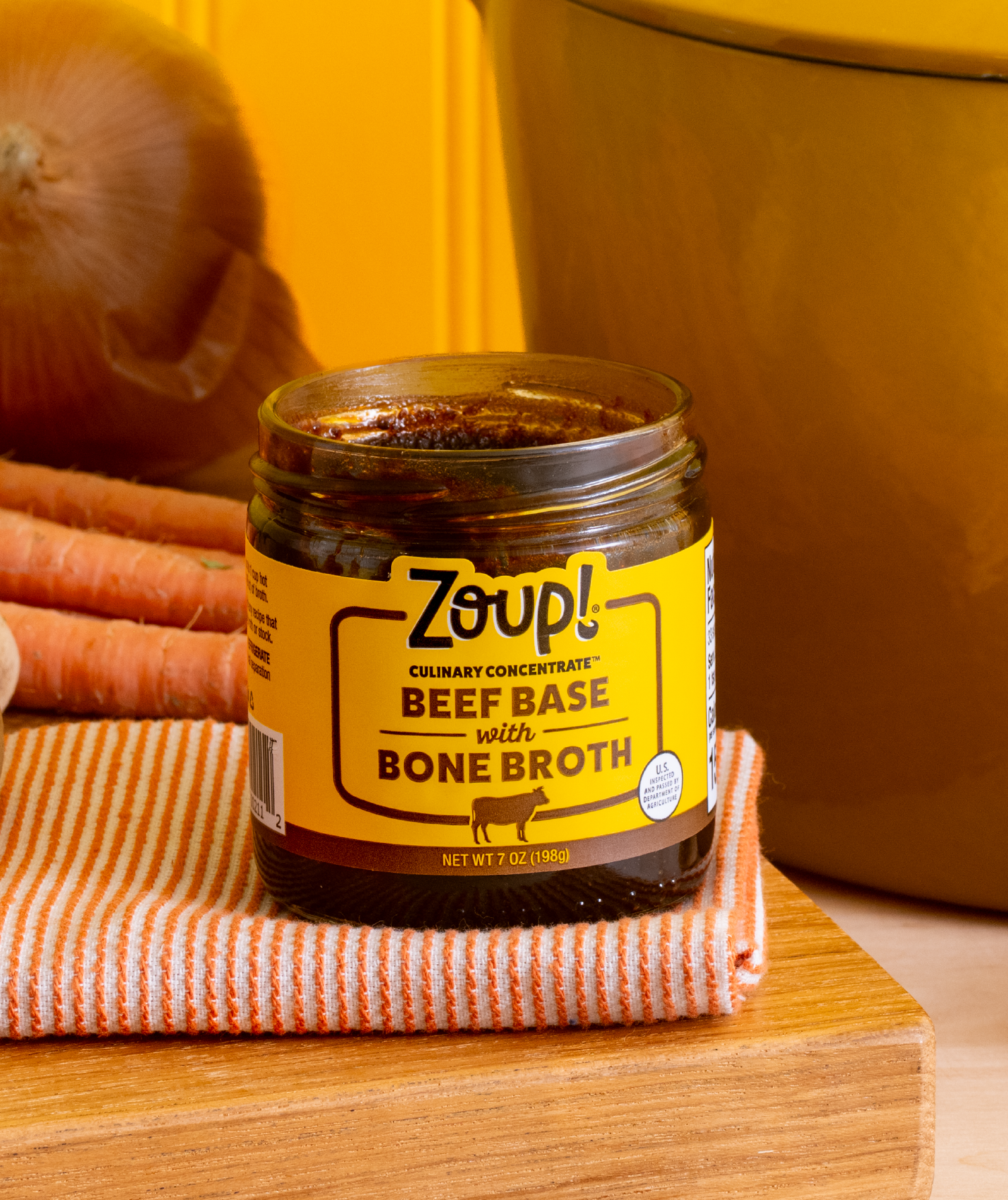
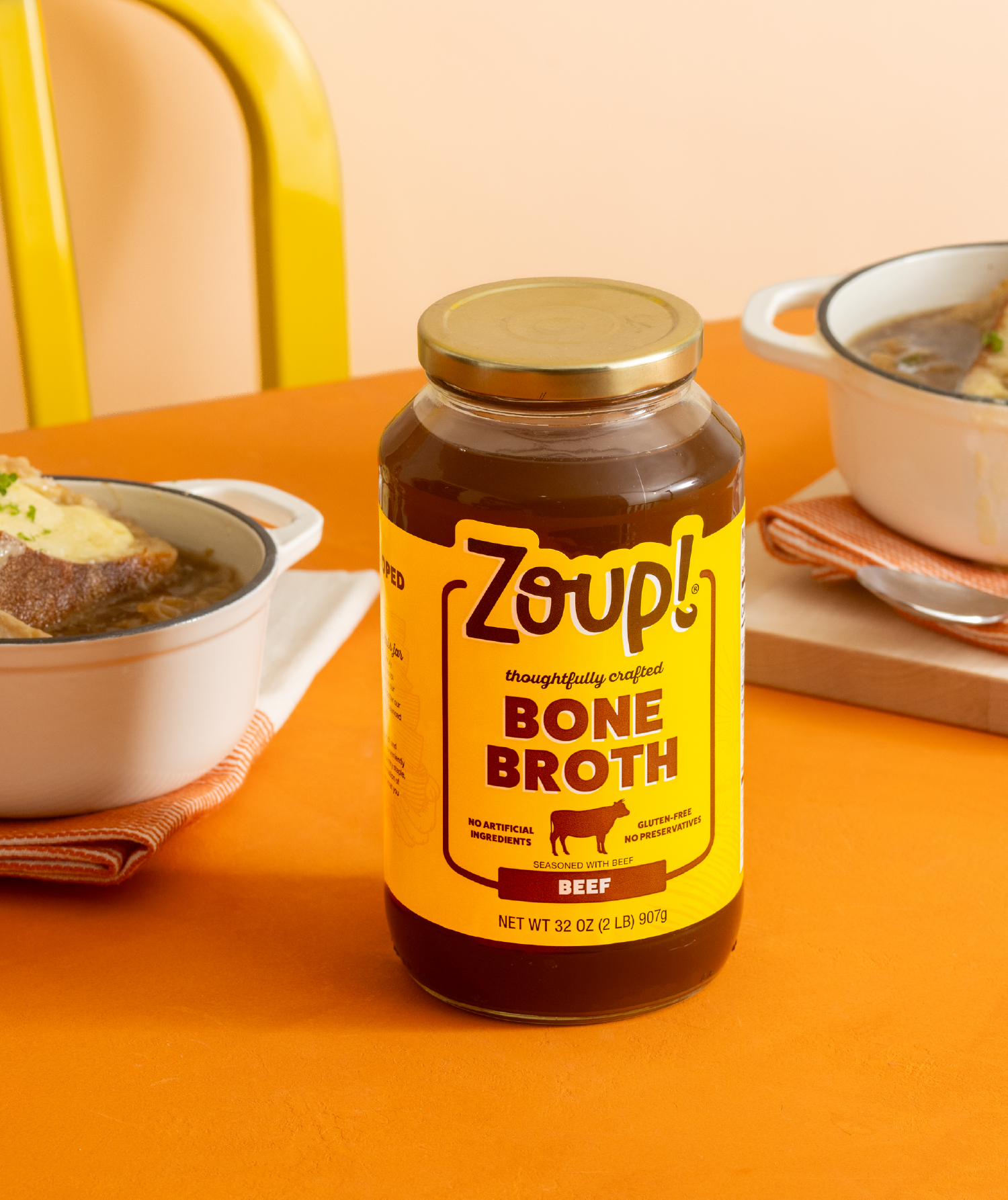
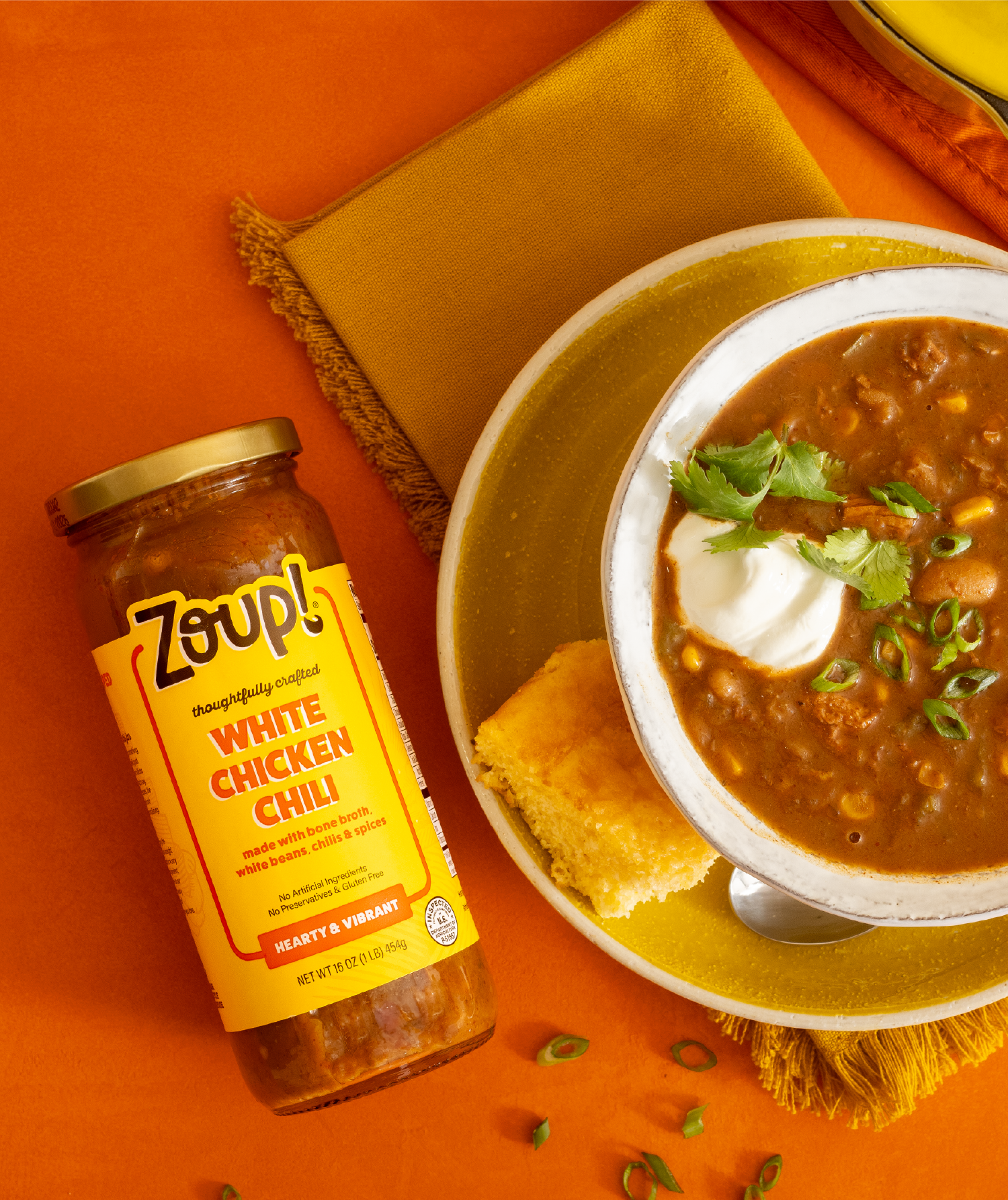
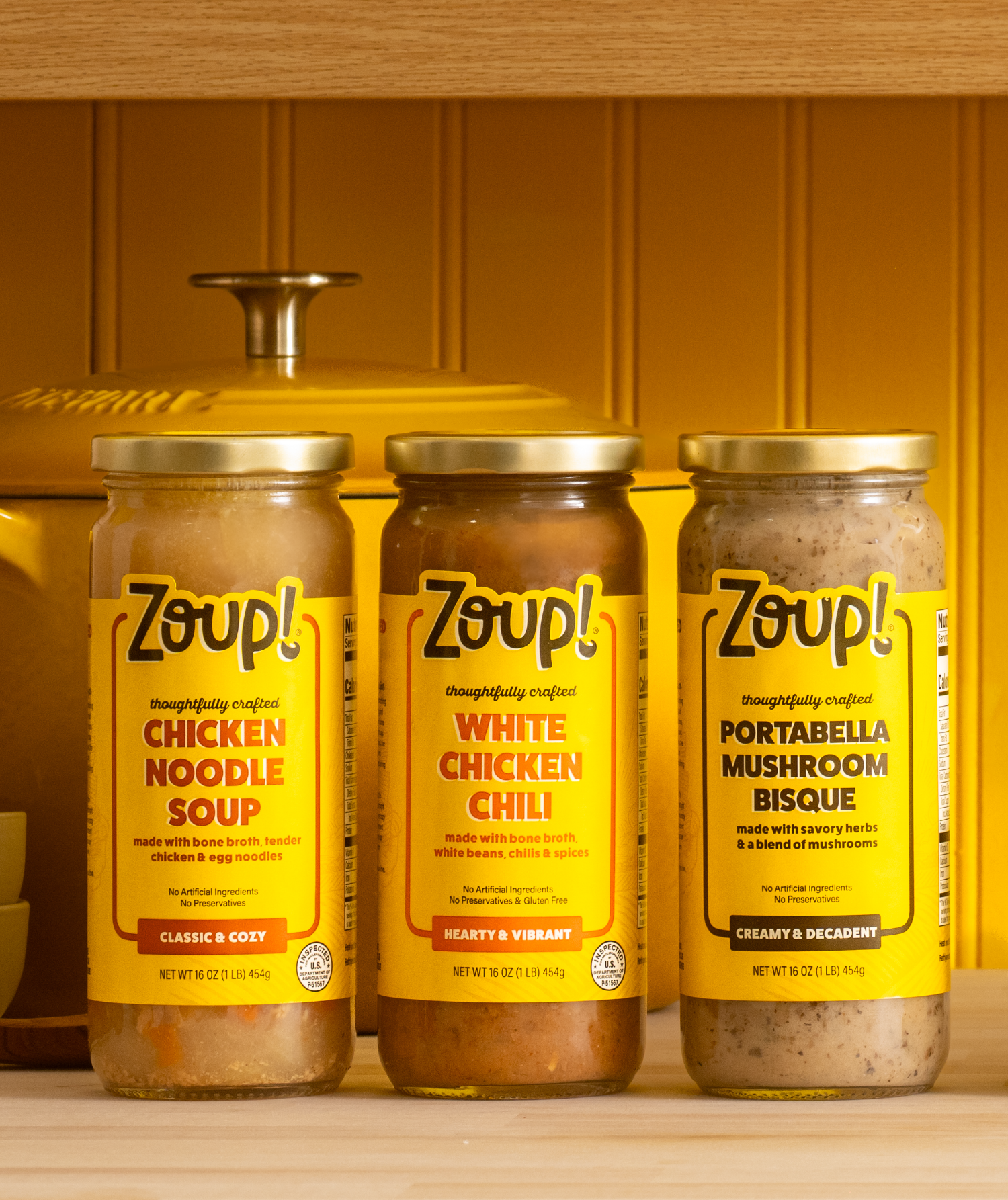
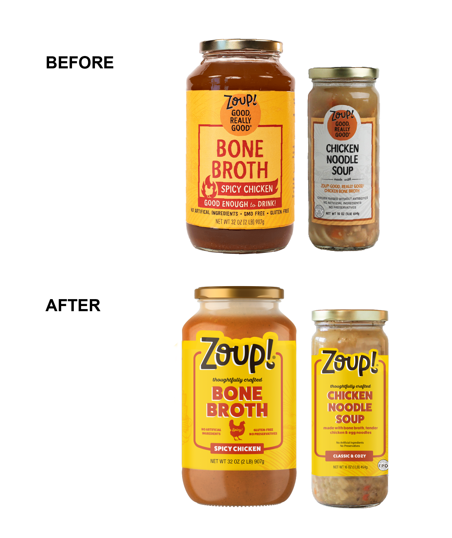
We refreshed Zoup!’s identity and packaging with a vibrant, updated color palette that remained true to the brand's iconic yellow label while enhancing its warmth and energy. The glass jars, a signature packaging element, were preserved to allow the product to shine, but we added a die-cut feature to the top of the label for added visual appeal.
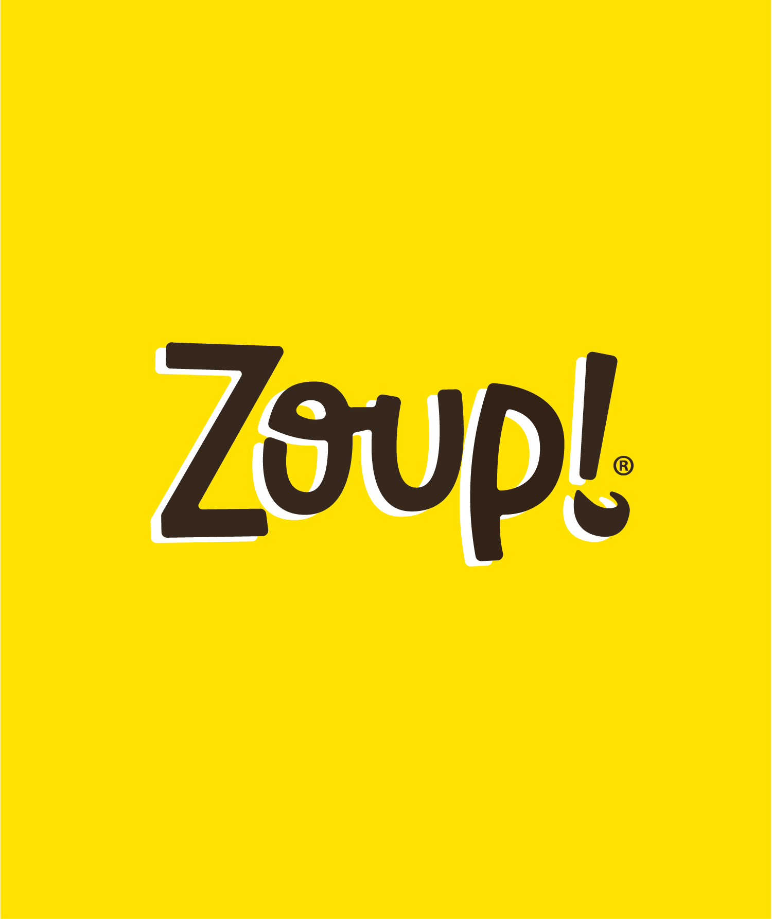
We also refined the messaging, crafting new copy that resonated more with consumers while still incorporating the brand's beloved, time-tested language. The logo was given more prominence, with subtle adjustments to the letterforms to make them feel warmer, more welcoming, and approachable. We updated the fonts to maintain the boldness of the brand while softening the overall look for greater approachability.
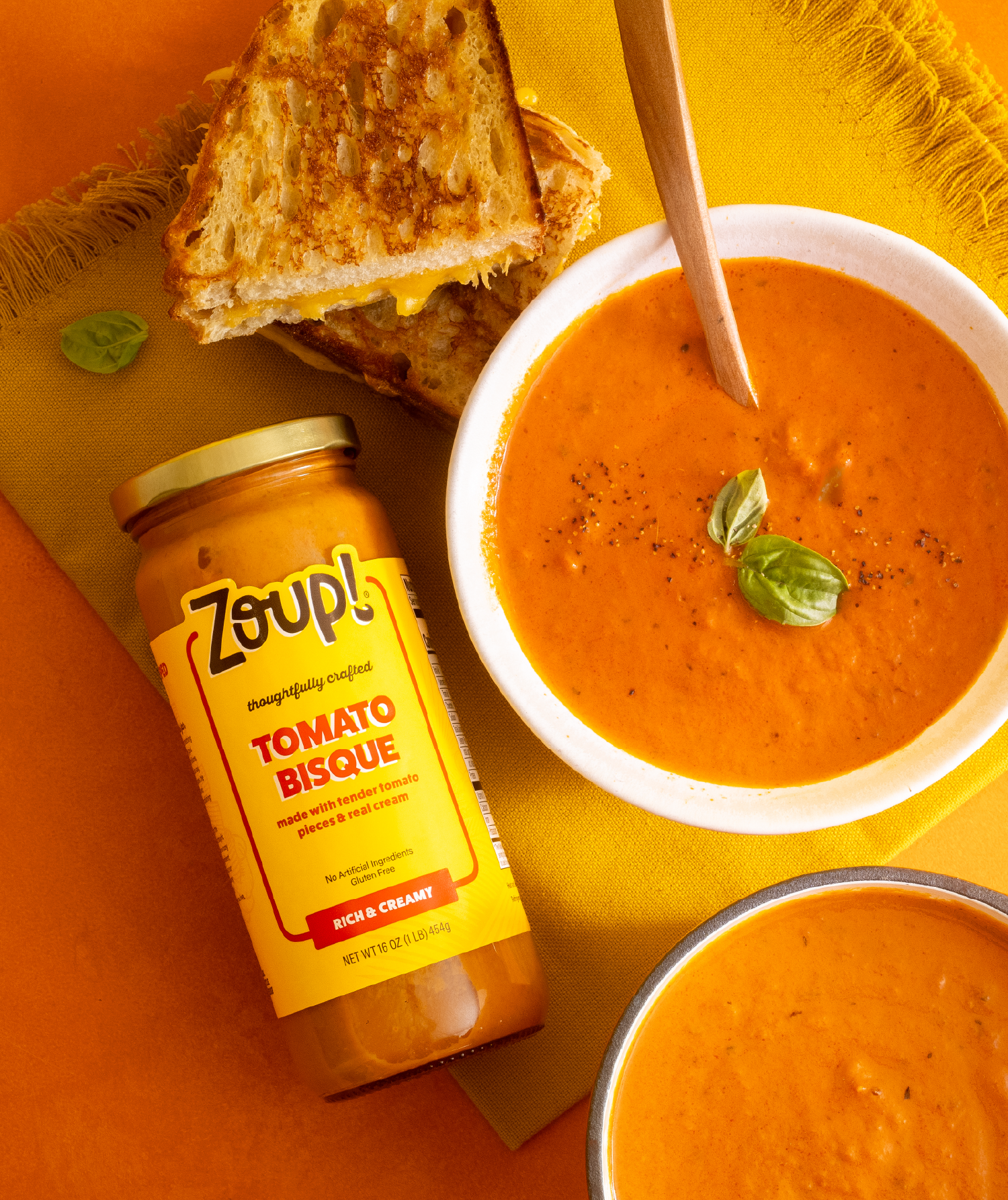
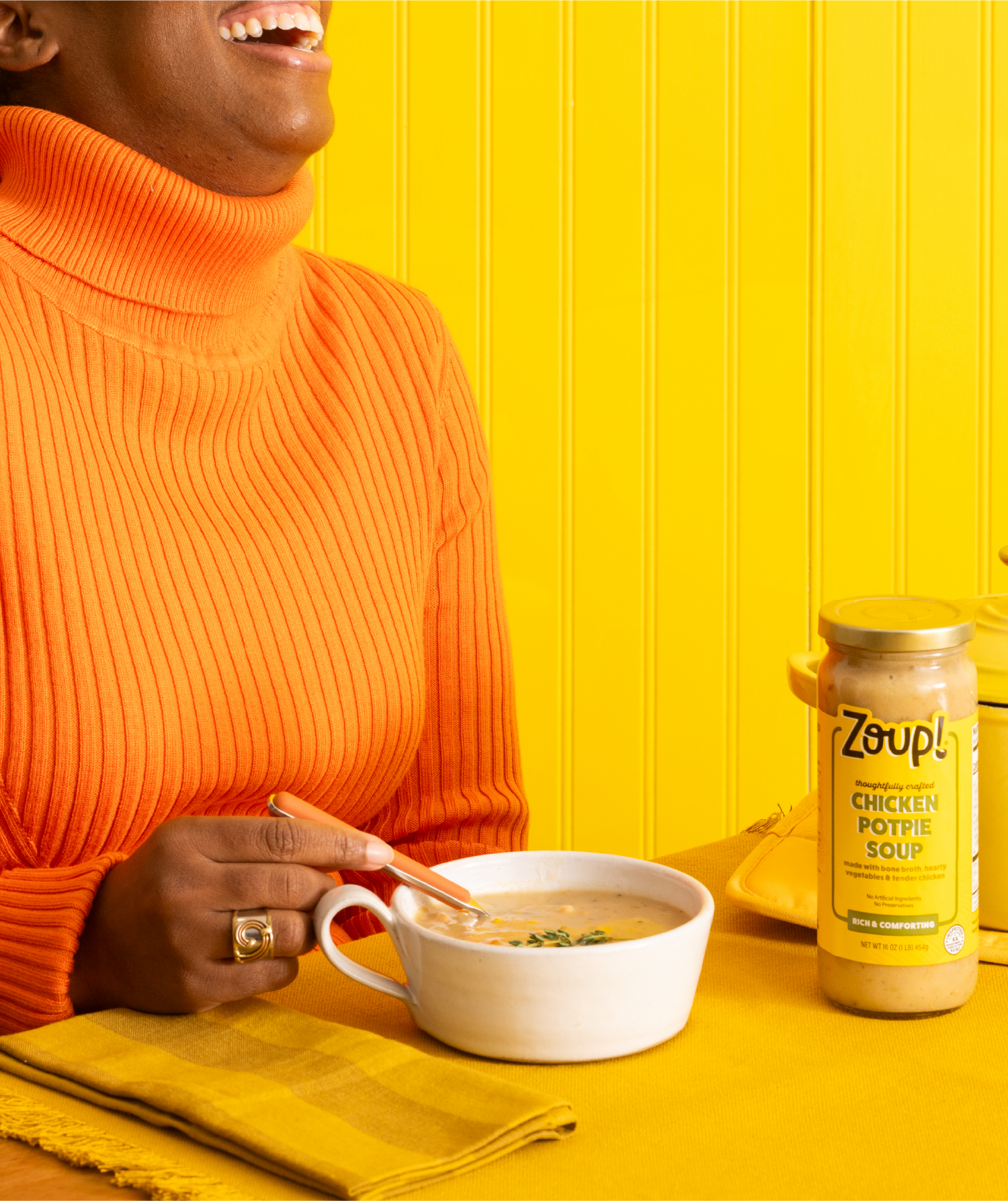
While preserving the brand’s established equity, these updates helped Zoup! stand out more prominently on shelf, making it not only recognizable but also more competitive in the marketplace.